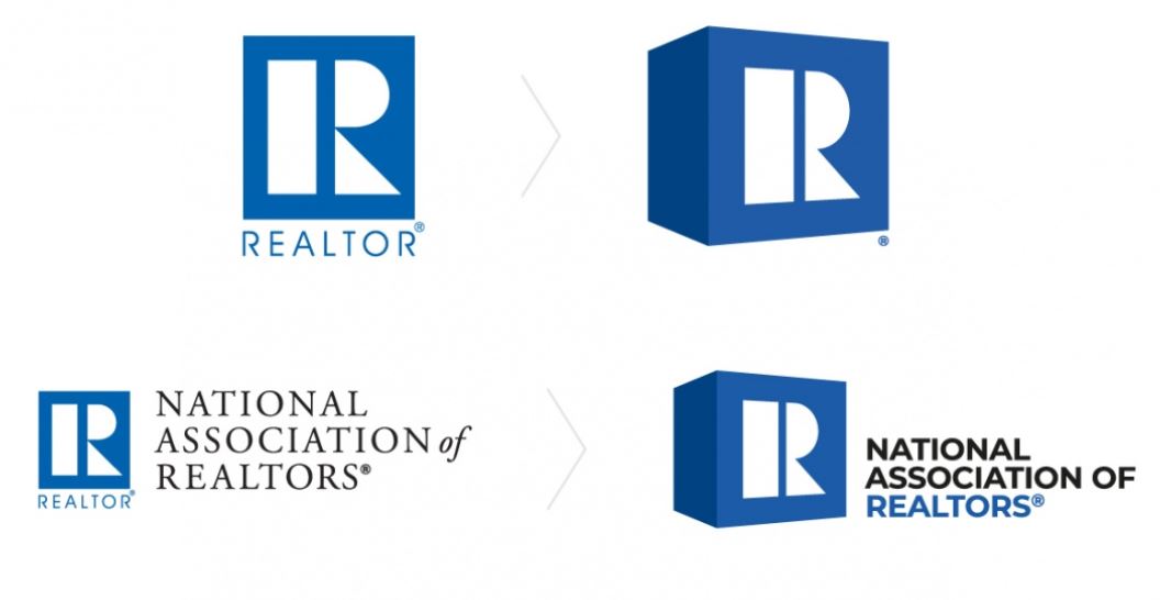
This ought to fix everything!
The REALTOR® brand represents the organization’s unique role and heritage in shaping the real estate industry over its 100-year history, where it has built tremendous brand equity among its members, partners and property buyers and sellers. But after 45 years, even an iconic brand needs an evolution to better represent our multi-faceted members and REALTOR® organization.
Evolving the REALTOR® logo required keeping the equity and recognition of the current bold, powerful and trusted trademark, while modernizing it to meet the realities of today’s marketplace and digital distribution. It also signals where the organization is headed and how it will continue to lead the real estate industry in the years ahead.
Technology, shifting market conditions and consumers are reshaping the real estate industry at a breakneck pace; and when I became NAR’s CEO last fall, I vowed to lead the association into the future and ensure that our members can compete and thrive in a dynamic marketplace. The new brand embodies the association’s rich history, but better reflects our forward-thinking focus and how we’ll stay ahead of industry evolution and disruption and continue to lead the real estate industry in the years ahead.
– NAR CEO Bob Goldberg


Amateurs are running a 1.3-million member trade group – unbelievable:
The National Association of Realtors (NAR) has just announced that it’s pausing its rollout of a newly redesigned logo introduced earlier this week — the first such redesign in 45 years — following a vocal backlash among some of the organization’s Realtor members.
The announcement on the pause was posted on NAR’s Facebook page on Wednesday evening and signed by CEO Bob Goldberg and President Elizabeth Mendenhall. Read it in full below:
After the announcement was made on Monday, the negative response was swift. A Change.org petition circulated on social media calling for the repeal of the new logo had garnered over 900 signatures by the Wednesday evening announcement.
A particular sticking point for many of the associations’ members was the estimated $250,000 cost, which Goldberg confirmed in a comment on Linkedin. However NAR was not available to comment on Wednesday night as to any additional costs that would be associated with continuing the process.
Originally the new logo — the iconic “R” printed in a bold sans-serif typeface called Montserrat along a tilted blue cube — was set to be phased over the next two years, starting this June. NAR members and associations that used the membership mark were asked to incorporate the new branding by December 2019.