Many years ago, we purchased a home in Carlsbad, using a realtor that was recommended to us - Jim Klinge. Fast forward to 2025, we recently had the privilege of selling 2 homes in Carlsbad, CA and didn't hesitate to reach out to Jim and Donna Klinge of Klinge Realty Group to guide us through the sales. The transactions were very different, each with its own unique situation, opportunities and challenges. From start to finish, Donna and Jim helped navigate the pre-sale preparation, the listing, showing of the house, buyer negotiations, the final close and all of the paperwork and decisions in between. What stands out with both transactions is the professionalism of Jim and Donna (and their team), wonderful communication (timely, relevant, concise), their deep understanding of market dynamics (setting realistic expectations), their access to top-notch contractors, and last, their ability to guide us across the finish line successfully. We wouldn't hesitate to use Jim and Donna in the future and highly recommend them for anyone looking to buy or sell a property in North San Diego County.


Where will the people who clean our houses, mow our yards, cook our food, stock our groceries, etc. live? Won’t we need more of these service workers as our population ages? Will affluent North County boomers be able to find the caregivers they need?
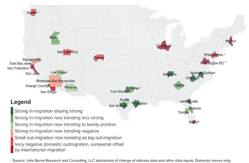
oooof, no one moves to Jacksonville by choice.
I agree Susan, try finding an affordable handyman., lawn service, daycare, restaurants. I guess many are counting on children or relatives for care down the line…………………….. not to mention broken cars, appliances, and deferred Maintenace of homes, roads, hospitals,
Anyone try to get a Drs appointment lately? 4-6 week wait unless you go to crowded ER. WE need a middle class, it’s what we built this nation on.