
An excerpt from Bill’s post today:
Since this post (in July, 2018), existing home sales have mostly moved sideways, and both new home sales and single family starts have hit new cycle highs.
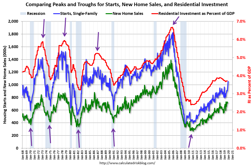
Here is the graph I like to use to track tops and bottoms for housing activity. This is a graph of Single family housing starts, New Home Sales, and Residential Investment (RI) as a percent of GDP.
The arrows point to some of the earlier peaks and troughs for these three measures.
The purpose of this graph is to show that these three indicators generally reach peaks and troughs together. Note that Residential Investment is quarterly and single-family starts and new home sales are monthly.
RI as a percent of GDP has been sluggish recently, mostly due to softness in multi-family residential. However, both single family starts and new home sales have set new cycle highs this year.
Also, look at the relatively low level of RI as a percent of GDP, new home sales and single family starts compared to previous peaks.
To have a significant downturn from these levels would be surprising.
Link to Bill’s post